---
title: "visualizing the past, present, and predictions"
image: kelp-pressing.jpg
description: Learning the art of data science
format:
html:
echo: true
eval: true
code-tools: true
code-fold: true
code-summary: "Show me the code!"
code-block-border-left: "#183d3d"
filters:
- lightbox
lightbox: auto
freeze: auto
date: 3/13/25
---
> **TL;DR** I recently took my first data visualization class. Until now, I'd only known data visualization as something sterile-centered around numbers and packed with as many data points as a journal would realistically publish. I thought good data visualizations were only found in research papers, but I've realized that good data visualizations (often the best) live inside a world that is just as much art as it is science. Below is my first crack at using the art of data visualization to conceptualize some of my seaweed science.
## Killing two birds with one class
I'm probably lying to myself when I say I don't know how it happens, but I seem to always inundate myself with projects until my mind is waterlogged. I'm constantly behind, so I'll always jump at an opportunity to kill two birds with one stone-or, in this case, one class. I recently took Environmental Data Science 240: Data Visualization at the Bren School of Environmental Science and Management, taught by [Sam Shanny-Csik](https://samanthacsik.github.io/) and teaching assistants [Annie Adams](https://annieradams.github.io/) and Sloane Stephenson. The stars could not have aligned better because not only was this an opportunity to learn from a data science icon like Sam (whose open source guides taught me data science principles and website design long before I was her student), but also because it gave me an opportunity to create figures for a paper that I've had in the works for over a year.
## Some context about FUNctional traits
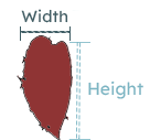
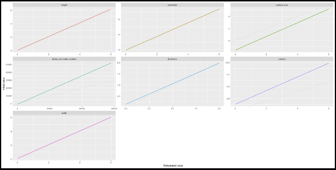
Before I dive into my data visualization process, here's some context about the paper I'm creating these data visualizations for. My paper is an extension of a project called [Past, Present, Predictions: functional approaches to link species to ecosystem function](https://haydenvega.github.io/research/2023-pastpresentpredictions/).It builds off the PhD thesis of one of my mentors and another data science icon, [An Bui](https://an-bui.com/). My project explores the idea that we can leverage the large collections of seaweeds that are preserved by museums and universities into long-term data about kelp forests. Many museums and universities have collections of seaweeds that span hundreds of specimens, species, and even years. These collections are used to studying the anatomy of seaweeds, but my project aims to study how these seaweeds functioned within their kelp forest. We can get data about a seaweed's function by measuring its characteristics like height, width, volume, or thickness. Measurements like these are called **functional traits** and they can give us clues as to how a seaweed contributed to kelp forest functions/characteristics such as photosynthetic rates, wave reduction, and overall mass of seaweed.
What's unique about <i>preserved</i> seaweed is that they are a snapshot in time, and we can use them as a window to the past of kelp forest function. Using preserved seaweed, we can observe how a kelp forest functioned at a point in time that predates any data we currently have. This is important because we can use our understanding of the past to predict how kelp forests will function in an uncertain future. But using preserved seaweed also presents a unique challenge when using functional traits.
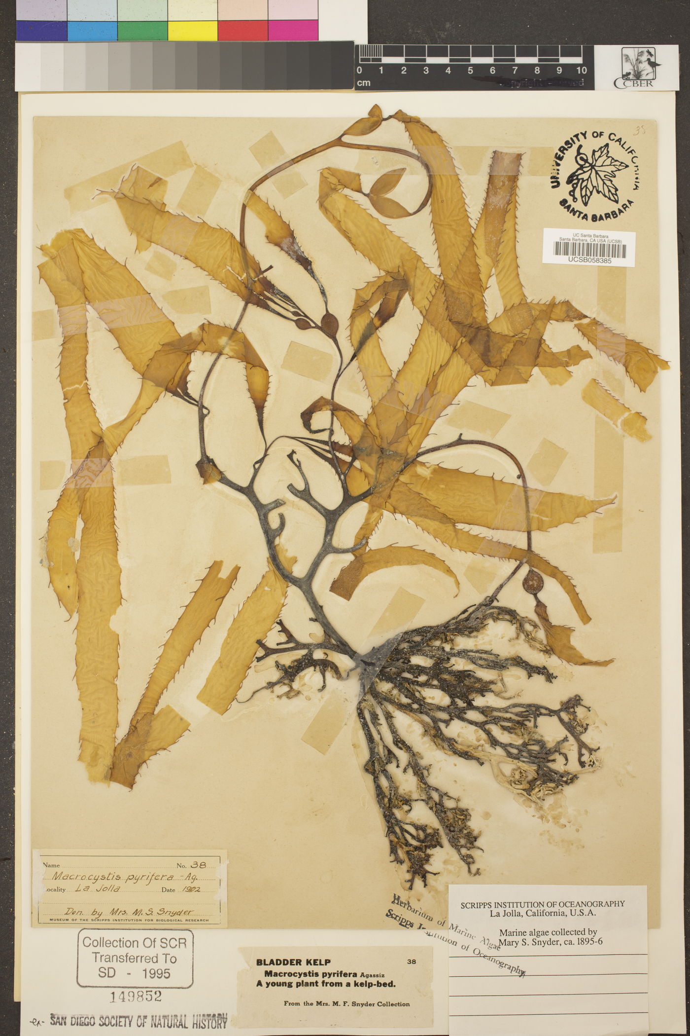
Universities and museums preserve seaweed by flattening specimens and slowly drying them out. During the process, the seaweeds shrink. This poses a challenge to a functional trait approach because our measurements are now biased by the preservation process. A seaweed with a height of 16 inches when it was initially collected may measure 8 inches after it is dried. **My project seeks to overcome this bias by creating models that use the functional traits of a preserved seaweed to predict the functional traits of that same seaweed before it was preserved.** And I will be visualizing these models in my plots below!
## The plot thickens
I started this process with two concrete goals for my visualizations: to show that our models vary by trait and to show that our models vary by species. But as I learned and thought more about the purpose of data visualization, I added a third goal: tell a story.
I wanted to show linear models, so I started with a line graph, just two axis and a line. This was perfect for showing the models, but there wasn't a story there. So I turned to embellishments like titles, labels, colors, and typography to add some narrative to my plots. I had an easy time creating titles and labels because I understood their purpose within a narrative. I had a harder time with elements like color and typography. I never even considered them as elements of a story. Even from a purely aesthetic perspective, I didn't understand them well. I realized I had been neglecting these components not only in my data visualizations, but also in my everyday life. This exercise in data visualization soon became an exercise in intentional design.
::: {layout="[[1], [1], [1]]"}
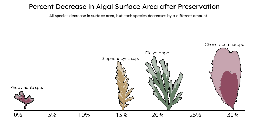{group="finalviz" description="A diagram quantifying extent to which a seaweed shrinks during the preservation process and that it varies by species."}
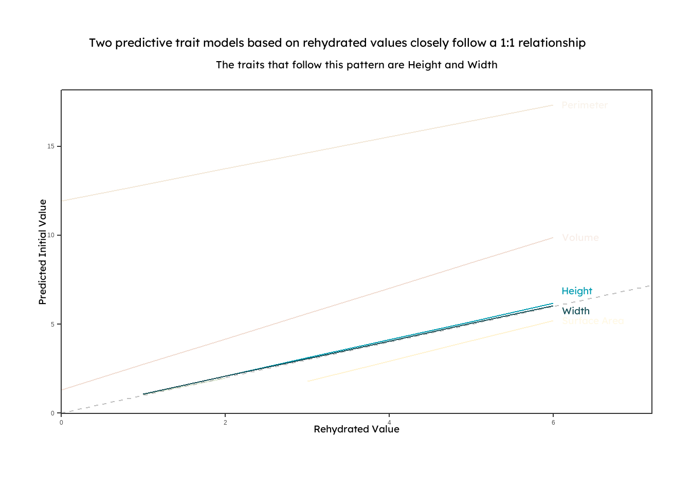
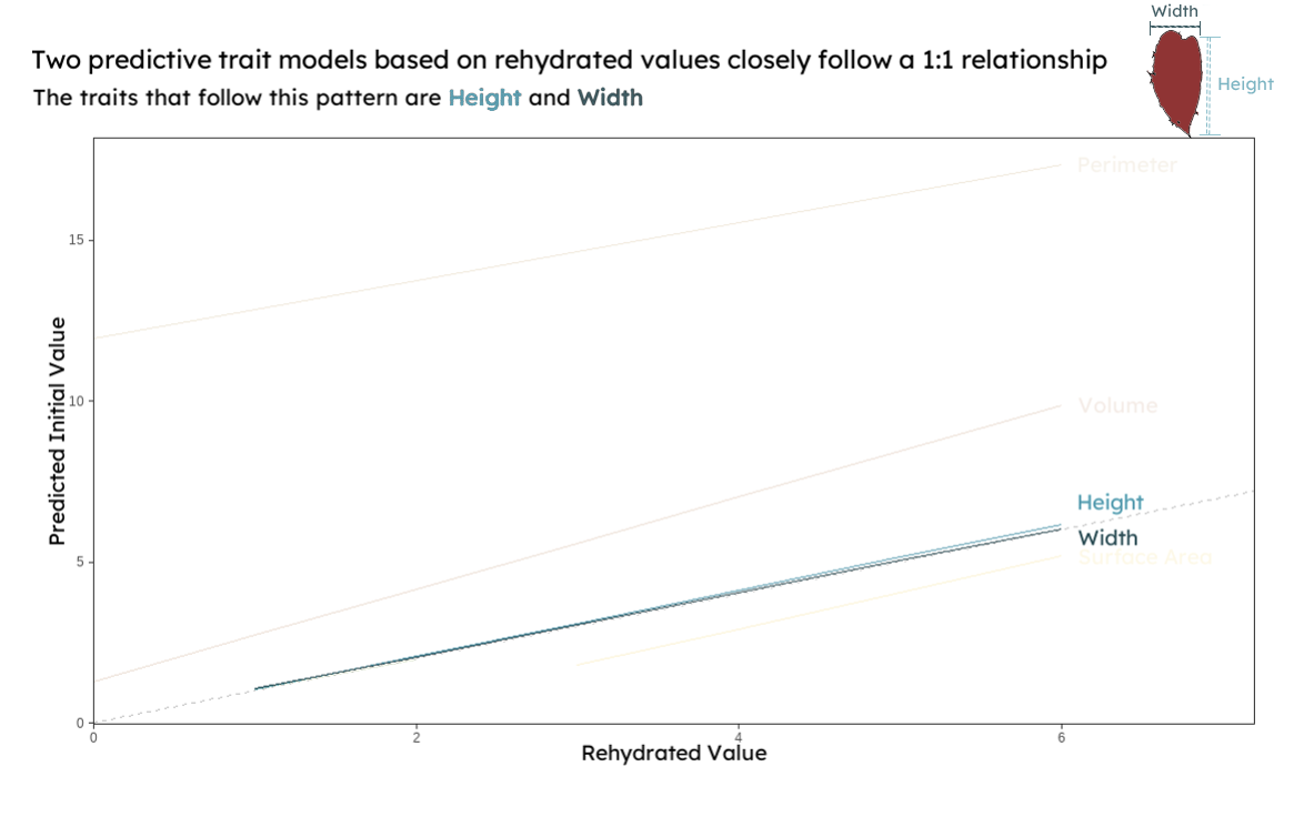{group="finalviz" description="A line graph displaying linear models that predict initial functional trait measurements based on rehydrated preserved seaweed. The models for height and width are highlighted to show that they closely follow a 1:1 relationship between initial and rehydrated measurements"}
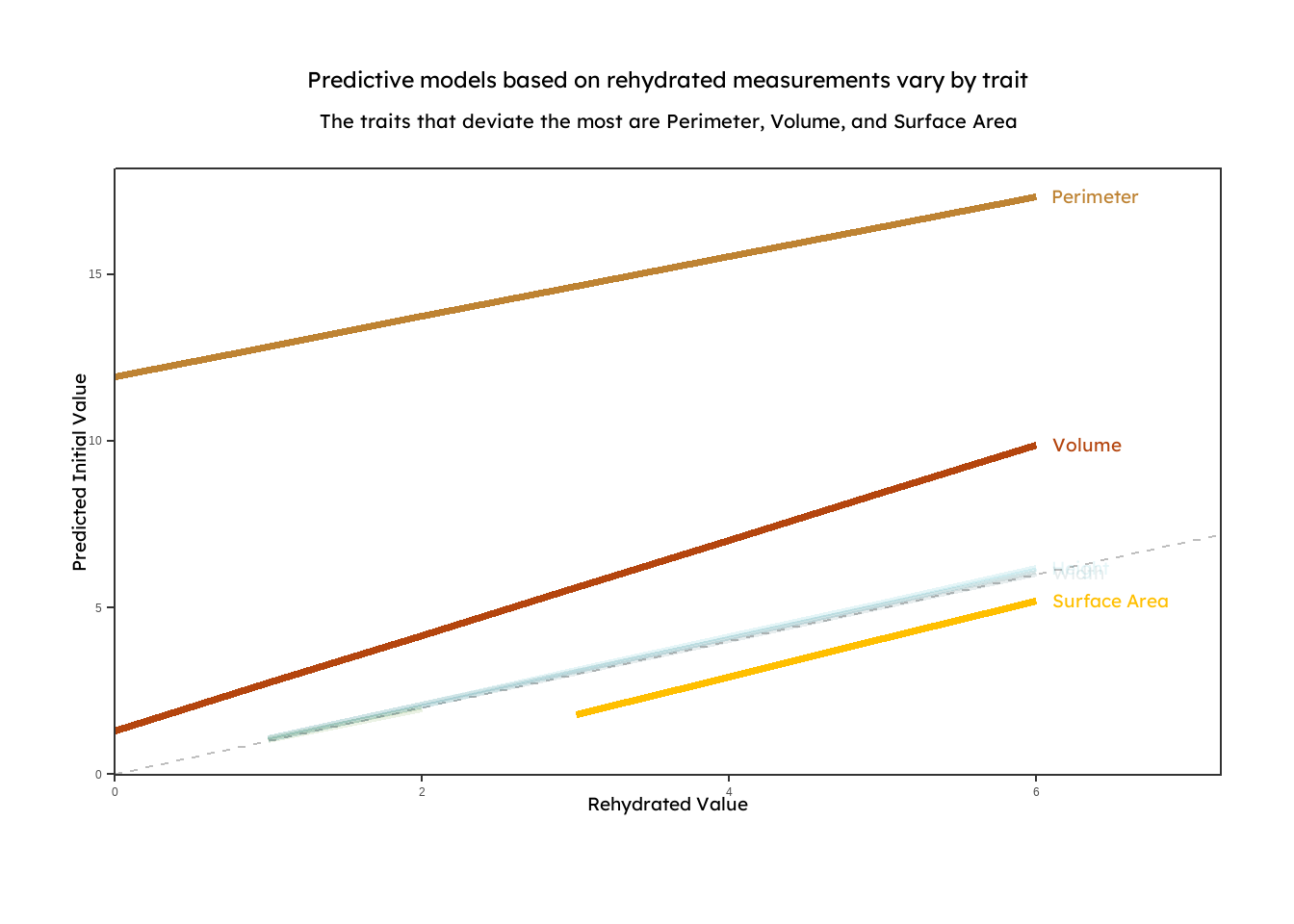
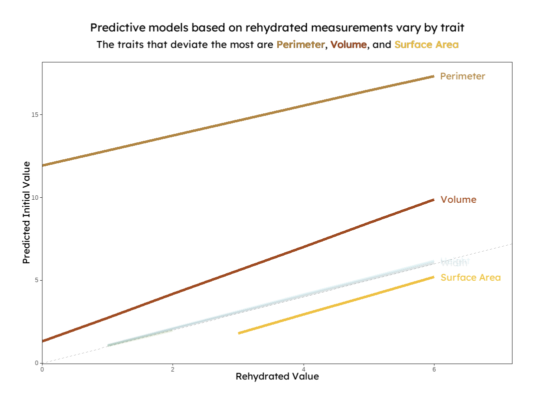{group="finalviz" description="A line graph displaying linear models that predict initial functional trait measurements based on rehydrated preserved seaweed. The models for perimeter, volume, and surface area are highlighted to show that they do not follow a 1:1 relationship between initial and rehydrated measurements. This suggests that predictive models are unique to each trait."}
:::
When thinking about the design of my plots, I started with the titles and subtitles. My goal was that they would give the reader the main takeaways from the plot. Data visualization is a complex language in itself. Putting my main takeaways in the titles helps the reader walk away with the main idea without even having to decipher the plot. As a result, my titles are broad and say something about the nature of the relationships shown (vary by species or follow a 1:1 line). Further specificity is available for readers in the plot. There I targeted multiple visual hierarchies to help the reader interpret the data from different angles, and I used embellishments like color and drawings to give the readers access to further complexity. Basic themes were used to minimize non-data ink and to draw attention to just the data being shown. An example where these elements were incorporated is in the shrinkage plot.
{group="finalviz" description="My favorite viz and a diagram quantifying extent to which a seaweed shrinks during the preservation process and that it varies by species."}
In this plot, the main takeaway is that the preservation process changes each species differently, suggesting that some models may need to be species-dependent. Here, each species is labeled and readers can determine the percent shrinkage by using the number line or by comparing the difference in area between the shaded regions in the drawing of the seaweed. For each species, the larger outline represents the size of a seaweed when it is initially collected, and the smaller, colored outline represents the algae after it has been dried, scaled down to its measured percent decrease. In this plot, I played around with the idea that color could convey complexity, and each color of the seaweeds that are drawn represents the family that the it belongs to (red - Rhodophyta, brown - Phaeophyta, and green - Chlorophyta). I also added in an appealing, professional font, which offers nothing other than a refreshing break from the default R font.
>[**A note about color:** One in twenty people has some form of color blindness. To increase accessibility in my visualizations, I used David Nichols's [Coloring for Colorblindness](https://davidmathlogic.com/colorblind/#%23D81B60-%23FFBF00-%2354662C-%23009BB0) to choose a palette for those who see colors differently. I also used colors from the [calecopal palette]() designed by the amazing An Bui, [Heili Lowman](https://www.heililowman.com/), Ana Sofia Guerra, and [Ana Miller-ter Kuile](https://anamtk.weebly.com/)]{.small-text}
## Concluding a story
Through this course, I've become more intentional with the elements I include in my visualizations, and I've gained new tools to tell the story of my data. Most of my experience with data visualization has been with those black and white figures you find in scientific journals; the ones that are either devoid of complexity or packed with so much information that it's hard to draw anything meaningful from there. By leaning into the artistic side of data visualization, we can tell whole stories with a few lines of code and some thoughtful design. I've always liked the intersection of art and science. Art speaks to us in a language that requires no translation, and it has the potential to increase access to the subject material. I now see that data science sits at the intersection of art and science. In the future, I hope to lean into the artistic side of data science to help science reach a wider audience.
## Figure Code
>[Below is the code used to render each of the plots. Some drawings and labels were created using the Adobe Suite. The shrinkage plot was created using data pulled manually from the ggpredict function for the herbarium models(x=3).]{.small-text}
### Setting up the models!
```{r, warning=FALSE, message=FALSE}
#| echo: true
#| eval: true
#| output: false
##~~~~~~~~~~~~~~~~~~~~~~~~~~~~~~~~~~~~~~~~~~~~~~~~~~~~~~~~~~~~~~~~~~~~~~~~~~~~~~
##                                    Setup                                 ----
##~~~~~~~~~~~~~~~~~~~~~~~~~~~~~~~~~~~~~~~~~~~~~~~~~~~~~~~~~~~~~~~~~~~~~~~~~~~~~~


#.........................load libraries.........................

library(janitor)
library(tidyverse)
library(ggeffects)
library(sjlabelled)
library(lme4)
library(DHARMa)
library(parameters)
library(effects)
library(MuMIn)
library(waffle)
library(showtext)

#.........................load fonts.........................
font_add_google(name = "Marcellus", family = "marc")
font_add_google(name = "Josefin Sans", family = "josefin")
font_add_google(name = "Lexend", family = "lex")

#.........................reading in data.........................

height_all <- read.csv("final_height.csv", header = TRUE, sep = ",") %>% separate_wider_delim(specimen_id, delim = "-", names = c("date", "site", "individual", "specimen"), cols_remove=FALSE) %>%
  unite("individual_id", date:individual, remove = TRUE, sep = "-")

width_all <- read.csv("final_width.csv", header = TRUE, sep = ",") %>% separate_wider_delim(specimen_id, delim = "-", names = c("date", "site", "individual", "specimen"), cols_remove=FALSE) %>%
  unite("individual_id", date:individual, remove = TRUE, sep = "-")

perimeter_all <- read.csv("final_perimeter.csv", header = TRUE, sep = ",") %>% separate_wider_delim(specimen_id, delim = "-", names = c("date", "site", "individual", "specimen"), cols_remove=FALSE) %>%
  unite("individual_id", date:individual, remove = TRUE, sep = "-")

surf_all <- read.csv("final_surf.csv", header = TRUE, sep = ",") %>% separate_wider_delim(specimen_id, delim = "-", names = c("date", "site", "individual", "specimen"), cols_remove=FALSE) %>%
  unite("individual_id", date:individual, remove = TRUE, sep = "-")

tdmc_all <- read.csv("final_tdmc.csv", header = TRUE, sep = ",") %>% separate_wider_delim(specimen_id, delim = "-", names = c("date", "site", "individual", "specimen"), cols_remove=FALSE) %>%
  unite("individual_id", date:individual, remove = TRUE, sep = "-")

thickness_all <- read.csv("final_thickness.csv", header = TRUE, sep = ",") %>% separate_wider_delim(specimen_id, delim = "-", names = c("date", "site", "individual", "specimen"), cols_remove=FALSE) %>%
  unite("individual_id", date:individual, remove = TRUE, sep = "-")

volume_all <- read.csv("final_volume.csv", header = TRUE, sep = ",") %>% separate_wider_delim(specimen_id, delim = "-", names = c("date", "site", "individual", "specimen"), cols_remove=FALSE) %>%
  unite("individual_id", date:individual, remove = TRUE, sep = "-")


# ggplot theme
theme_set(theme_bw() +
            theme(panel.grid = element_blank(),
                  plot.background = element_blank()))

# abline color
ref_line_col <- "grey"

# model prediction color
model_col <- "darkblue"


#.........................model making.........................

height_reg_ir <- lmer(height_i ~ height_r * species + (1 | individual_id), data = height_all)
summary(height_reg_ir)

height_reg_ir_nospecies <- lmer(height_i ~ height_r + (1 | individual_id), data = height_all)
summary(height_reg_ir_nospecies)

width_reg_ir <- lmer(width_i ~ width_r * species + (1 | individual_id), data = width_all)


width_reg_ir_nospecies <- lmer(width_i ~ width_r + (1 | individual_id), data = width_all)
summary(width_reg_ir_nospecies)

perimeter_reg_ir <- lmer(per_i ~ per_r * species + (1 | individual_id), data = perimeter_all)
summary(perimeter_reg_ir)

perimeter_reg_ir_nospecies <- lmer(per_i ~ per_r + (1 | individual_id), data = perimeter_all)
summary(perimeter_reg_ir_nospecies)

surf_reg_ir <- lmer(surf_i ~ surf_r * species + (1 | individual_id), data = surf_all)
summary(surf_reg_ir)

surf_reg_ir_nospecies <- lmer(surf_i ~ surf_r + (1 | individual_id), data = surf_all)
summary(surf_reg_ir_nospecies)

tdmc_reg_ir <- lmer(weight_i ~ weight_r * species + (1 | individual_id), data = tdmc_all)
summary(tdmc_reg_ir)

tdmc_reg_ir_nospecies <- lmer(weight_i ~ weight_r + (1 | individual_id), data = tdmc_all)
summary(tdmc_reg_ir_nospecies)

thick_reg_ir <- lmer(thick_i ~ thick_r * species + (1 | individual_id), data = thickness_all)
summary(thick_reg_ir)

thick_reg_ir_nospecies <- lmer(thick_i ~ thick_r + (1 | individual_id), data = thickness_all)
summary(thick_reg_ir_nospecies)

volume_reg_ir <- lmer(vol_i ~ vol_r * species + (1 | individual_id), data = volume_all)
summary(volume_reg_ir)

volume_reg_ir_nospecies <- lmer(vol_i ~ vol_r + (1 | individual_id), data = volume_all)
summary(volume_reg_ir_nospecies)


#.........................save models as predictions.........................


height_ir_predictions <- ggpredict(height_reg_ir_nospecies, terms = "height_r[0:45]") %>%
  mutate(trait = "height")

width_ir_predictions <- ggpredict(width_reg_ir_nospecies, terms = "width_r[0:30]") %>% #max width = 24
  mutate(trait = "width")

perimeter_ir_predictions <- ggpredict(perimeter_reg_ir, terms = "per_r[0:375]") %>%
  mutate(trait = "perimeter")

perimeter_ir_predictions_species <- ggpredict(perimeter_reg_ir, terms = c("per_r", "species")) %>%
  as_tibble() %>%
  rename(species = group)

surf_ir_predictions <- ggpredict(surf_reg_ir, terms = "surf_r[0:430]") %>%
  mutate(trait = "surface area")

surf_ir_predictions_species <- ggpredict(surf_reg_ir, terms = c("surf_r", "species")) %>%
  as_tibble() %>%
  rename(species = group)

tdmc_ir_predictions <- ggpredict(tdmc_reg_ir, terms = "weight_r[0:29050]") %>%
  as_tibble() %>%
  mutate(trait = "thallus dry matter content")

tdmc_ir_predictions_species <- ggpredict(tdmc_reg_ir, terms = c("weight_r", "species")) %>%
  as_tibble() %>%
  rename(species = group)

thick_ir_predictions <- ggpredict(thick_reg_ir_nospecies, terms = "thick_r[0:2]")  %>%
  mutate(trait = "thickness")
volume_ir_predictions <- ggpredict(volume_reg_ir, terms = "vol_r[0:30]") %>%
  mutate(trait = "volume")

volume_ir_predictions_species <- ggpredict(volume_reg_ir, terms = c("vol_r", "species")) %>%
  as_tibble() %>%
  rename(species = group)

#create a combined dataframe with all predictions
init_rehy_df <- rbind(surf_ir_predictions, # rbind stacks data frames on top of each other if they have the same columns
                      perimeter_ir_predictions,
                      tdmc_ir_predictions,
                      height_ir_predictions,
                      width_ir_predictions,
                      thick_ir_predictions,
                      volume_ir_predictions) %>%
  drop_na()

init <- init_rehy_df
```
### Plot highlighting 1:1 relationships
```{r, warning=FALSE, message=FALSE}
#.........................assigning opacity values (manually).........................
init23 <- init[init$trait != "thallus dry matter content"]
init23$opacity <- ifelse(init23$trait == "height", 3,
                      ifelse(init23$trait == "width", 3,
                             ifelse(init23$trait == "perimeter", 0.1,
                                    ifelse(init23$trait == "surface area", 0.1,
                                                  ifelse(init23$trait == "thickness", 0.1,
                                                         ifelse(init23$trait == "volume", 0.1, NA ))))))

#.........................manually offsetting the heigh - width labels.........................
label_df <- init23 %>%
  filter(x == max(x)) %>%
  mutate(label = stringr::str_to_title(trait),
         nudge_y = case_when(
           trait == "height" ~ 0.7,
           trait == "width" ~ -0.3,
           TRUE ~ 0
         ))

#.........................titles and palettes.........................
title <- "Two predictive trait models based on rehydrated values closely follow a 1:1 relationship"
subtitle <- "The traits that follow this pattern are Height and Width"

showtext_auto()
trait_palette <- c("surface area" = "#ffbf00",
                   "perimeter" = "#be8333",
                  # "thallus dry matter content" = "#54662c",
                   "height" = "#009bb0",
                   "width" = "#124c54",
                   "thickness" = "#368000",
                   "volume" = "#b4450e")

#.........................plotting.........................
 plot_ir_1s <- init23 %>%
  ggplot(aes(x, predicted, color = trait, alpha = opacity))+
  geom_line()+
  geom_abline(slope = 1, # adding a dashed grey 1:1 reference line
              intercept = 0,
              color = "grey",
              linetype = 2) +
  # geom_ribbon(aes(fill = trait, # adding 95% CI (uncomment this if you want to see it)
  #                 ymin = conf.low,
  #                 ymax = conf.high),
  #             alpha = 0.2) +
  geom_line(
            linewidth = 0.5) + # plotting model predictions
  labs(x = "Rehydrated Value", # renaming the axes
       y = "Predicted Initial Value",
       title = title,
       subtitle = subtitle) +
  scale_color_manual(values = trait_palette)+
  theme(legend.position = "none",
        plot.background = element_blank())+
  geom_text(
    data = init23 %>% filter(x == max(x)) %>% mutate(label = stringr::str_to_title(trait)),
    aes(label = label, alpha = opacity),
    hjust = 0,
    nudge_x = 0.1,
    nudge_y = label_df$nudge_y,
    size = 5,
    family = "lex",
    #alpha = opacity
    #fontface = "light"
  )+
  coord_cartesian(xlim = c(0, 7.2),
                  clip = "off")+
  theme(plot.margin = margin(t = 1, r = 1, b = 1, l = 1, "cm"))+
   theme(axis.title.x = element_text(family = "lex",
                                 size = 14,
                                 hjust = 0.5,
                                 margin = margin(t = 0, r = 0, b = 0.5, l = 0, "cm")),
         axis.title.y = element_text(family = "lex",
                                 size = 14,
                                 hjust = 0.5,
                                 margin = margin(t = 0, r = 0, b = 0.5, l = 0, "cm")),
          plot.title = element_text(family = "lex",
                              size = 17,
                              hjust = 0.5,
                              margin = margin(t = 0, r = 1, b = 0.3, l = 0, "cm")),
    plot.subtitle = element_text(family = "lex",
                                 size = 15,
                                 hjust = 0.5,
                                 margin = margin(t = 0, r = 0, b = 0.5, l = 0, "cm")))+
  scale_x_continuous(expand = c(0, NA))+
  scale_y_continuous(limits = c(0.8,NA))

 plot_ir_1s
```
### Plot highlighting deviations from a 1:1 relationship
```{r, warning=FALSE, message=FALSE}
#.........................assigning opacity values (manually).........................
showtext_auto()
init <- init_rehy_df
init2 <- as.data.frame(init) %>%
  mutate(trait = as.factor(trait))

init2 <- init[init$trait != "thallus dry matter content"]
init2$opacity <- ifelse(init2$trait == "height", 1,
                      ifelse(init2$trait == "width", 1,
                             ifelse(init2$trait == "perimeter", 3,
                                    ifelse(init2$trait == "surface area", 3,
                                                  ifelse(init2$trait == "thickness", 1,
                                                         ifelse(init2$trait == "volume", 3, NA ))))))

#.........................titles and palettes.........................

title <- "Predictive models based on rehydrated measurements vary by trait"
subtitle <- "The traits that deviate the most are Perimeter, Volume, and Surface Area"

showtext_auto()
trait_palette <- c("surface area" = "#ffbf00",
                   "perimeter" = "#be8333",
                  # "thallus dry matter content" = "#54662c",
                   "height" = "#009bb0",
                   "width" = "#124c54",
                   "thickness" = "#368000",
                   "volume" = "#b4450e")

#.........................plotting.........................

plot_ir_deviants <- init2 %>%
  ggplot(aes(x, predicted, color = trait, alpha = opacity))+
  geom_line()+
  geom_abline(slope = 1, # adding a dashed grey 1:1 reference line
              intercept = 0,
              color = "grey",
              linetype = 2) +
  # geom_ribbon(aes(fill = trait, # adding 95% CI (uncomment this if you want to see it)
  #                 ymin = conf.low,
  #                 ymax = conf.high),
  #             alpha = 0.2) +
  geom_line(
            linewidth = 1.5) + # plotting model predictions
  labs(x = "Rehydrated Value", # renaming the axes
       y = "Predicted Initial Value",
       title = title,
       subtitle = subtitle) +
  scale_color_manual(values = trait_palette)+
  theme(legend.position = "none",
        plot.background = element_blank())+
  geom_text(
    data = init2 %>% filter(x == max(x)) %>% mutate(label = stringr::str_to_title(trait)),
    aes(label = label),
    hjust = 0,
    nudge_x = 0.1,
    size = 5,
    family = "lex"
    #fontface = "light"
  )+
  coord_cartesian(xlim = c(0, 7.2),
                  clip = "off")+
  theme(plot.margin = margin(t = 1, r = 1, b = 1, l = 1, "cm"))+
   theme(axis.title.x = element_text(family = "lex",
                                 size = 14,
                                 hjust = 0.5,
                                 margin = margin(t = 0, r = 0, b = 0.5, l = 0, "cm")),
         axis.title.y = element_text(family = "lex",
                                 size = 14,
                                 hjust = 0.5,
                                 margin = margin(t = 0, r = 0, b = 0.5, l = 0, "cm")),
          plot.title = element_text(family = "lex",
                              size = 17,
                              hjust = 0.5,
                              margin = margin(t = 0, r = 0, b = 0.3, l = 0, "cm")),
    plot.subtitle = element_text(family = "lex",
                                 size = 15,
                                 hjust = 0.5,
                                 margin = margin(t = 0, r = 0, b = 0.5, l = 0, "cm")))+
  scale_x_continuous(expand = c(0, NA))+
  scale_y_continuous(limits = c(0.8,NA))

plot_ir_deviants
```